Opening the Volume Distribution Chart
OR
OR
Select the preferred counter and press F8 from your keyboard.
Explanation
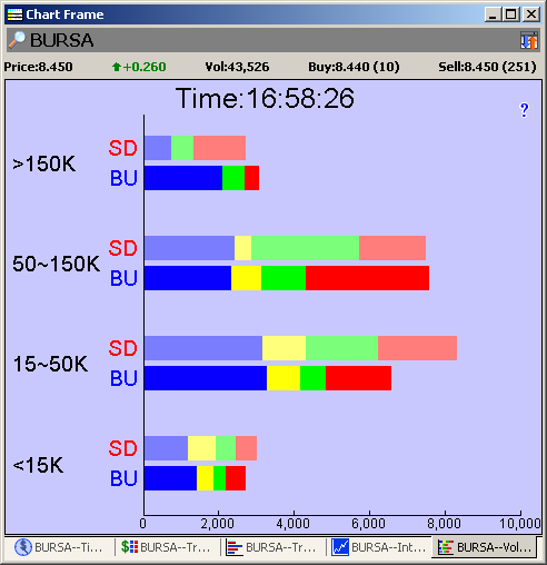
1. The Volume Distribution Chart displays in graphical format all the transactions done
by
grouping these into the size of transaction and further dividing this into buy ups from the
sell queue and sell downs to the buy queue. The purpose of the chart is to give the
investor an overall view of the performance of the counter throughout the day. Volume
distribution Chart groups the transactions based on their size. For each group, the total
volume done on the buy queue and sell queue is shown while the time of transaction is
indicated by color code.
2. X-axis indicates the volume done.
Y-axis indicates the size of the transactions (Volume x Price).
3. There are 2 bars for each of the y axis categories denoting the buy up bar and the sell
down bar.
SD indicates Sell Down
BU indicates Buy Up
|
Hint:
|
The key to reading these charts is to focus on the mid sized and large sized transactions.
|
Note
• It is important to note that each of these buy ups or sell downs is a complete
transaction by itself.
• Buy up means that the transaction has taken place in the sell queue because there
has been a match-up between buyer and seller. An occurrence of a buy up
transaction does not mean that there is a corresponding sell down. Likewise, an
occurrence of a sell down transaction does not mean that there is a corresponding
buy up.
See Also: